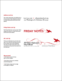
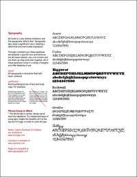
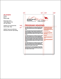
All Saints Day School approached Ande La Monica, creative director of Ande & Partners, to re brand the institution and attempt to unify All Saints and its five sister schools. They needed a new identity and a graphics program that would encompass signage, marketing materials, direct mail, web design, and a massive amount of templates.
All Saints
Day School
Brand Development
Identity
Style Guide
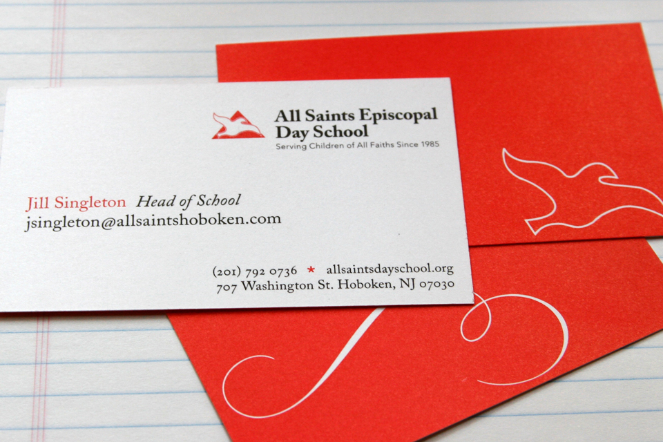
Stationery System
Marketing Materials
“One of the big problems,” says Ande La Monica, “is that over the years All Saints has amassed over 20 different logos. The good thing was that they are variations of the same concept. The dove and the triangle were compelling symbols to work with. They were stylized to form a crest. The typography incorporated into the logo is both academic and friendly. All together, the identity has a strong and established feel to it."

Educational Marketing
One of the strengths of All Saints as an institution is that they have a very diverse student base. In order to convey that visually, a set of talk bubbles was designed for use in their graphic system. Like the students, the talk bubbles come in a variety of shapes, colors, and sizes.


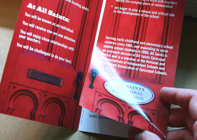
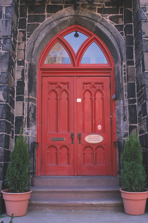
"Another interesting point is that the All Saints Church has this wonderfully huge red arching doorway at the entrance," Ande explains. "The door has probably been there since the beginning and it has this magical quality to it… like straight out of Harry Potter. We wanted to incorporate the welcoming doors and the beautiful red color into the design system as much as we could."
Marketing Materials



Style Guide and Design Templates

