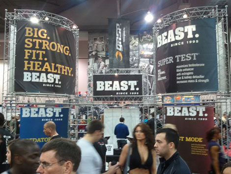
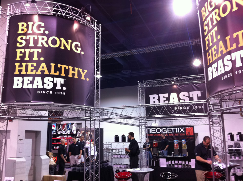
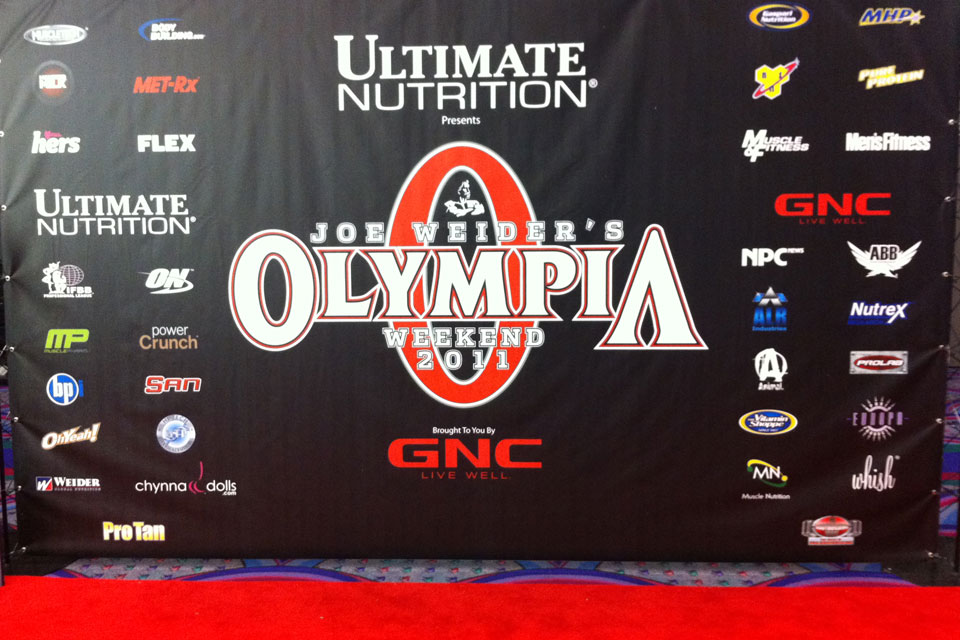
Tony Altieri, owner and president of Beast Sports, contacted Ande La Monica and said, "We've hit a plateau and are looking for your guidance in helping us improve our brand." 18 months later, the product line went from 6 to more than 20 items, sales for top vendors doubled in some cases - tripled in others, and they received high praise from the heads of Vitamin Shoppe, GNC, and BodyBuilding.com - including winning the coveted Breakout Brand of the Year. Beast Sports achieved more success in a short time with Ande & Partners than in 15 years with anyone else.

Beast Sports
Nutrition
Brand Strategy
Brand Development
Naming
Identity
Packaging
Style Guide
Stationery System
Photography
Website
Marketing Materials
Sales Catalog
Web Films
Advertising
Trade Booth
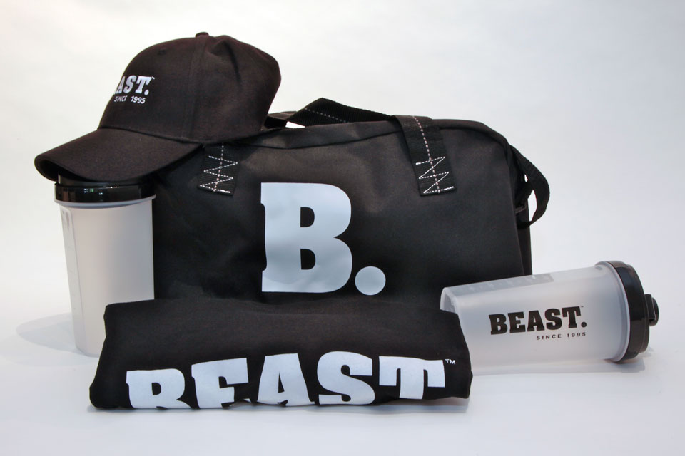
Merchandise
Signage
Beast Sports Nutrition turned to Ande & Partners to develop the brand identity and packaging for their line of products. In a market that is over-saturated with similar offerings, it is hard for a consumer to distinguish between good products and cheap knock-offs. Beast wanted to stand apart from the competition and highlight the quality of their product as well as the integrity of their company.
Established in 1995, Beast is a privately held company headquartered in Florida. Beast was founded by Tony Altieri out of a persistent dedication to physical fitness. Over the years, Beast has been a long-standing company providing nutrition and supplements to the physical fitness, professional athletic, bodybuilding, weight training, sports conditioning, and mixed martial arts communities.
Logo Rebranding

Fixing the packaging
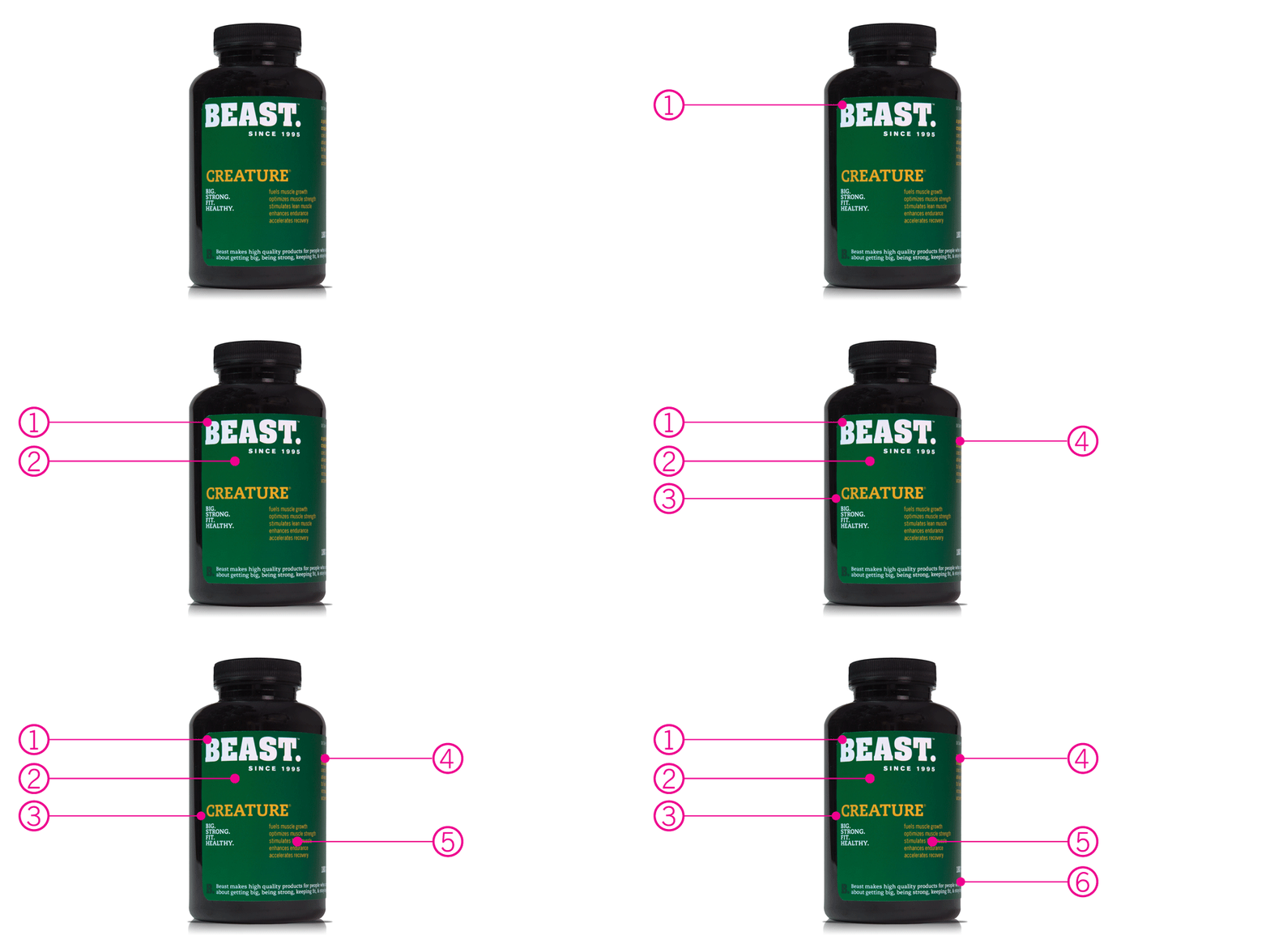
Product Packaging
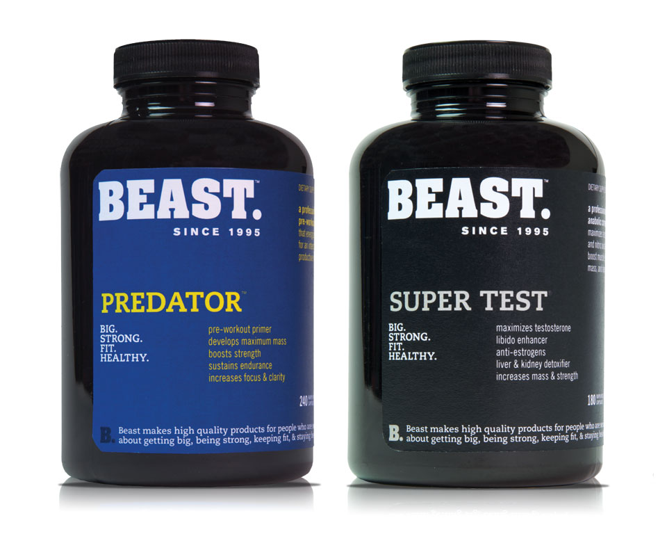
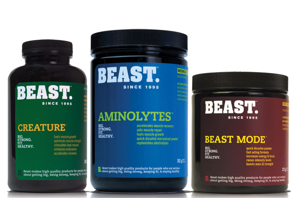
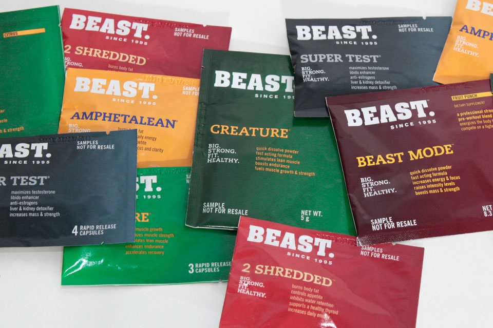
The brand identity developed by Ande & Partners is clear, bold, and functional. “When you look at nutritional supplements in the marketplace, it gets confusing very easily,” says Ande La Monica, creative director at Ande & Partners. “Most of the brands on the shelf look the same, they are not transparent about what goes in the product or the purity of the ingredients, nor are they very original or innovative.” Ande continued, “There are even a few products that resemble toxic cleaning supplies.”
To develop the strong foundation of the Beast brand, Ande & Partners and the Beast team did extensive research and took a fresh look at the Beast history and the competitive landscape. The Beast brand is about being big and strong, but it is also about being fit and healthy. The new direction is a balance of those four elements.
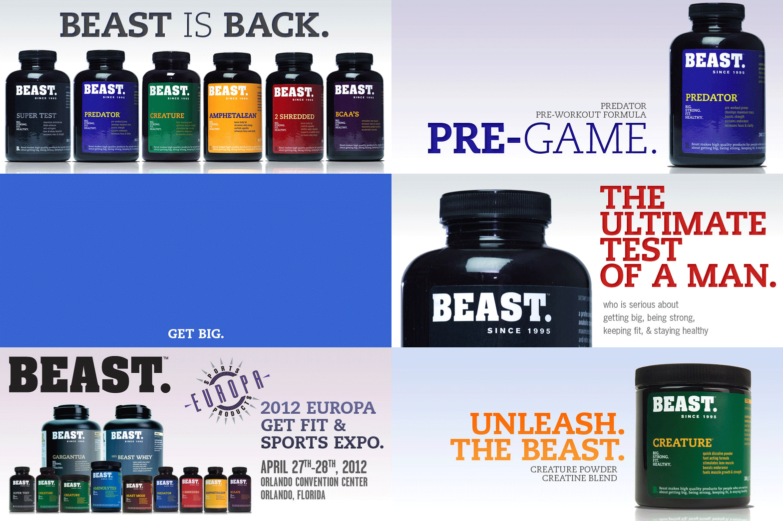
The new design makes the Beast brand highly recognizable and allows for a variety of differentiation with all of their product offerings. Simple typography on the packaging clearly articulates the product benefits and how it can help the consumer with their training needs. The color palette is bold and friendly. The logo was redesigned. The “eye” is gone and the word “beast.” was redesigned to be solid and strong which is true to the brand. The period at the end of the word references that Beast is the last word in sports nutrition. Beast makes great products. Period. End of story.
Simple Typography = versatile Marketing System
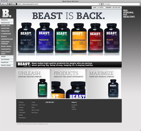
The Website designed by Ande & Partners

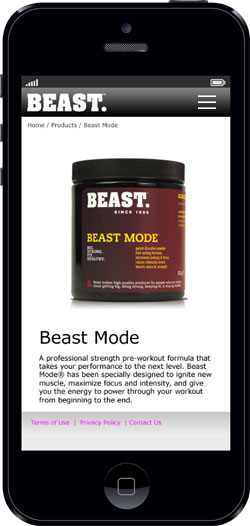
Mobile Platform and ECommerce Development
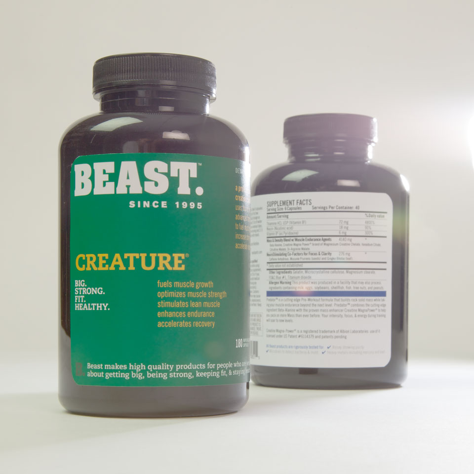
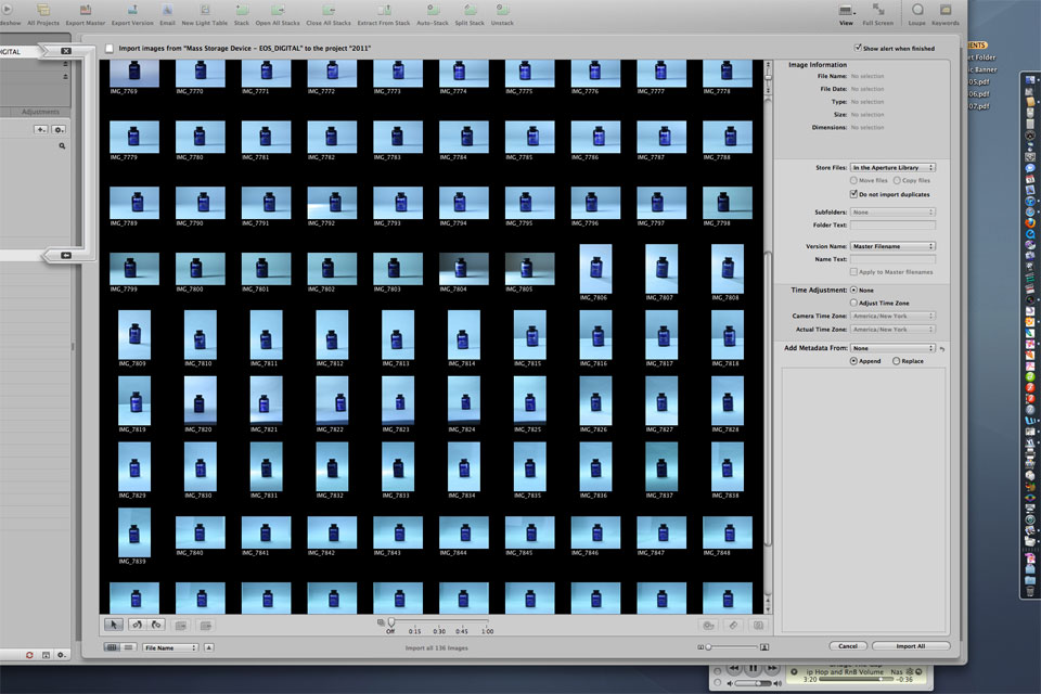
Product Photography
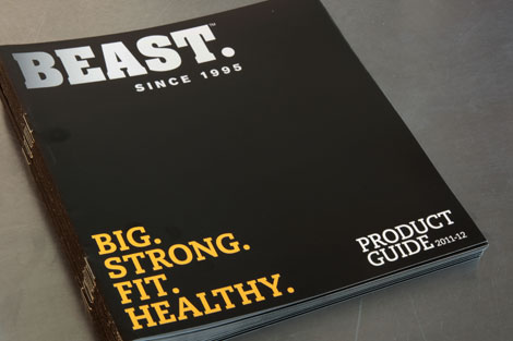
Sales Catalog
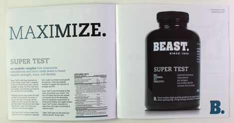
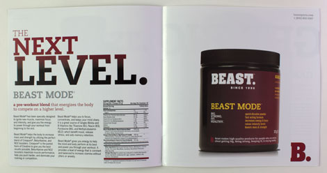
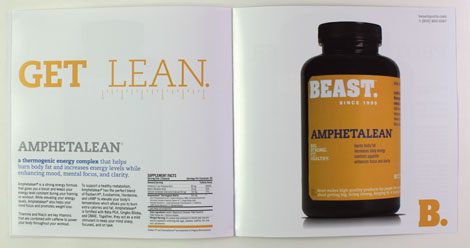
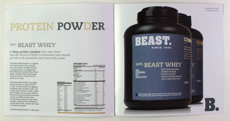
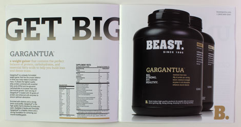
Sales Kits and Sell Sheets
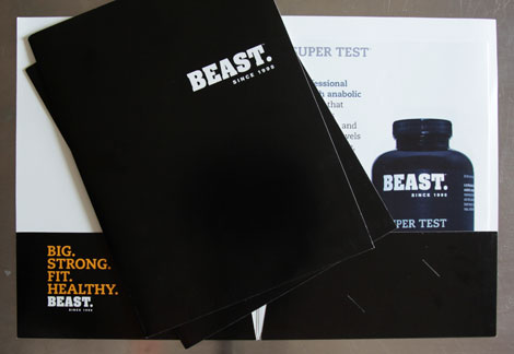
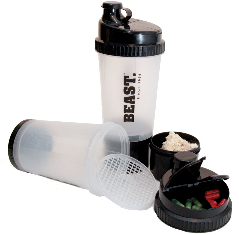
Products
Trade Show Booth
